Illustrator tasks
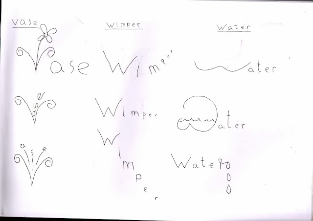
Typeface expression
Type face expression
------------------------------------------------------------------------
-----------------------------------------------------------------
-------------------------------------------------------------------
----------------------------------------------------------------
--------------------------------------------------------------------------
haiku development

haiku final products
-------------------------------------------------------------------------------
--------------------------------------------------------------------------------
------------------------------------------------------------------------------
development of ideas
final digital product
Poster research
---------------------------------------------------------------------------
Font type research
initial thoughts mood boards
Initial ideas for poster design
My plan for future development
For my visuals development i plan to acquire images from secondary sources (google) and primary resources (photos taken from home), having all my images saved ill add them to my collection of secondary sources images in illustrator.
for my initial sketches i am going to scan them in and live trace into illustrator my two favourite designs i wanna go for, and work with colour variations for each.
Finally with colours in mind ill begin to draw/sketch out my two favourite designs and continue to develop further using my primary and secondary visuals collected from my visual development project in illustrator, then live trace the final development designs into illustrator via live trace and pick my favourite design overall that came out.
Final poster (visual based)
First draft
second draft
Third draft
Fourth draft
Final
Final poster (typeface based)
First draft
End design report
What have I learned?
Many and varied techniques concerning with adobe
illustrator with using tools such as the pen and gaining better knowledge on
paths.
How type can have such a heavy impact on
design in a poster with how it can either set a mood by changing color or shape
and overall style, also to grab attention from passers by if its aesthetically
pleasing. And how type can be cleverly combined or blended in with graphics in
certain poster to create a unique way of getting across an image to the viewer.
The advantages of research when going into
initial ideas (sketches) and development of ideas with my poster work, to seek
out starting inspiration really helped with coming up with layouts and overall
“rules” to follow.
Better understanding of color and how
complimentary color’s or the various other pairings can effect a design and
make it more pleasing on the eye, also with ease when reading when color backgrounds
are mainly used on coloured type, picking the right color or opposing colors
can really make type stand out against the background.
How did you develop your initial idea?
When I came up with my initial
sketches/ideas always one design stuck out for me and was determined to use the
base image as it was drawn but in development of this idea I changed the color
scheme, experimented with various complimentary colors, coming up with a set color
scheme I liked I began to add type to the poster.
I had
the main festival title as the sole decorative font and the details (which
should be always made easier to read and on the eyes) I used a serif font, so
clear block letters giving clear meaning of the message I wanted to get across.
Then
I began to adjust the layout and placement of the type objects used to make
sure they were not cluttered up to much and created some negative space around
each type object to help draw in viewers attention on each, with a clear
separation of the objects with a decorative underline.
Rate the effectiveness of your final
outcomes
with my visual based rock poster I found
difficulties with some things concerning some pen tool glitches and effective
color blending in the end I found both issues were resolved and came out alright
since I could hide a lot with the pen tool glitches using layers and I found a
simple but effective way with how I could portray the hair by using the black
negative space to achieve the look of the root to the hair and the purple being
on the edge seeming like highlights still (took the idea from Saul bass’s
style, retro).
I also particularly liked the way how the
eyes and mouth make a stand out point being layer on a translucent grey
background, which added to my main theme that old glam rock style with focus on
makeup around eyes and mouth back then.
A bad point I would give about my final
outcome on my poster would be the main title, looking back I would of liked to
add more visual elements to it.
Type based rock poster I really liked how
the contrast between purple and black turned out I found it gave it more of an
“eye catching feel” to it only issue I would raise about the poster would be
the amount of information on page, and
how it seemed to me to be too cluttered and blended in with the main titile too
much which initially I wanted or tried to make the main focal point of my
poster and have the minor details down below.
I would definitely re think size of type
used in my poster and possibly used different wording saving page space.
------------------------------------------------------------End-------------------------------------------------------------
------------------------------------------------------------End-------------------------------------------------------------


.jpg)
.jpg)
.jpg)
.jpg)
.jpg)
.jpg)
.jpg)

No comments:
Post a Comment