My Saul bass research
Scouring the net i have found these 6 inspired saul bass themed movie posters.

As you can see the overall them/style judging from the lines, shapes and tone its very simplistic and to the point giving clear understanding which was always one of saul bass's goals.

Here i have attempted my own saul bass inspired movie posters by looking at the previous research of secondary resources of saul bass movie posters, and tried to capture the retro-minamilist style you see below.
.png)

Font research
A collection of letters designed as a saul bass inspired typeface, looking over various type faces across the net that fit the saul bass theme, i have created my own version of a handmade/cut out typeface (which spells out napoleon dynamite)

Animated title sequence
Napoleon dynamite
Moodboards
These food products appear alot within the napoleon dynamite film although some may not appear as often as others they hold some attachment to an iconic/memorable scene in the film.

Colours here are the main collection derived from the main characters themselves more than anything, so for instance the brown would associate to napoleons brown suit in the prom. this helps me give an overall colour scheme to follow when creating my finished title sequence.

Again more iconic items that stand out among others within the film, the objects themselves gives me stuff to work with for shapes to create within flash.

Below ive compiled a variety of areas/surroundings of which the majority of the is film is situated and shot, also giving me ideas on what sort of scenery/background i can use for sequence.

Initial development of ideas
Mind map + Y chart


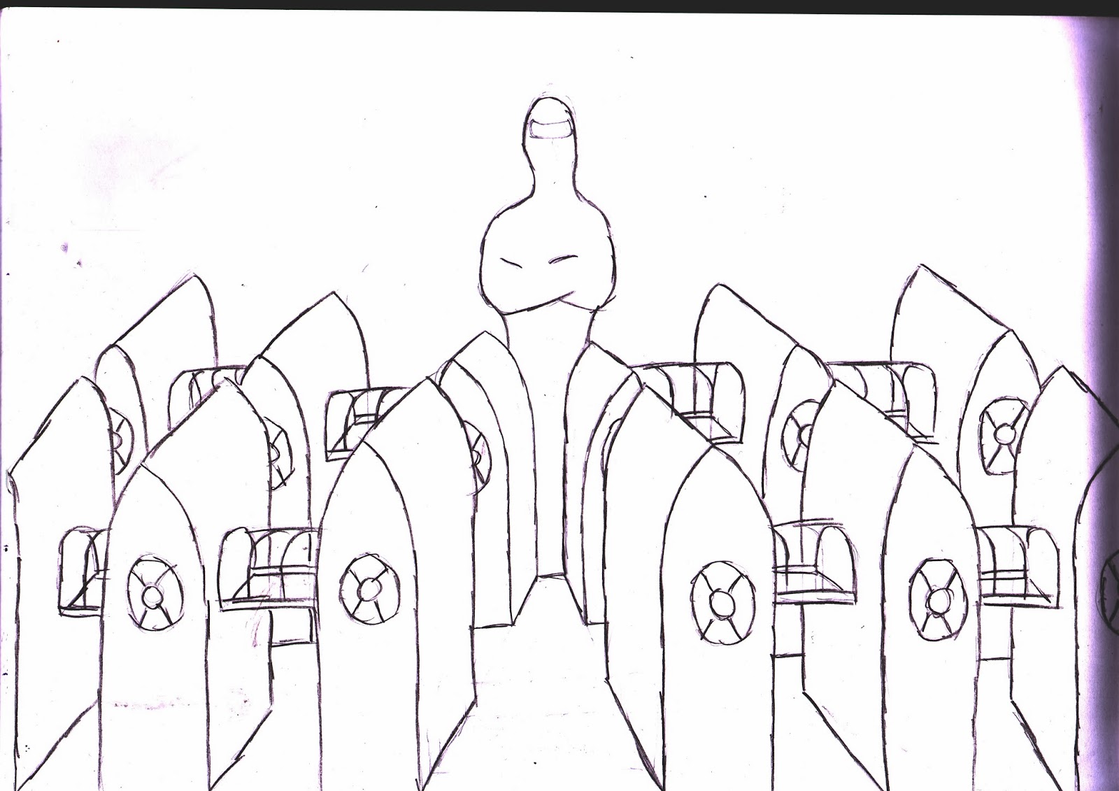
Thumbnail sketches

Although this collection of images shares no relevance with napoleon dynamite it still helped give me and idea on how to look at objects and apply visual metaphors to them to create something new e.g character, setting, enemy.
Development of initial ideas
for each of the images below i took an iconic item/object (from my mind map of ideas) and initially drew a rather detailed sketch of each chosen object. i then proceeded to work on simplifying each sketch to its basic shapes, helping me to get an idea of how to work with them in flash animation.
Tina the llama

Debs camera

Napoleon's (famous) brown suit

steak (everyone was eating it)

Swing ball (one of napoleons skills)

Napoleon's choice of refreshment

Storyboards


Final draft